Friday, March 05, 2010
Economic boosterism
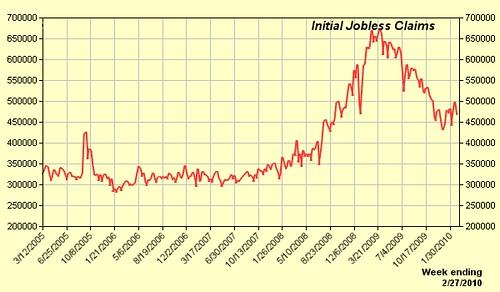
Take a good look at the graph above. See that last little tic downwards on the right end? Squint if you have to! As a fluctuation, it's about the same size as the fluctuation every single week since 2005 represented in the graph. Well, that's what I see. AP sees it differently:
New claims for jobless benefits fell last week in a sign that layoffs may be easing as the economy slowly recovers.The truth, to any scientist or for that matter anyone with two eyes, is that what the graph shows is that while initial jobless claims surged throughout 2008, peaking around March, 2009, and then declined, they have been at a plateau since November, 2009 and are for all intents and purposes unchanged since then (if anything, they're on a slight upward trend in those past few months).
They also show something else, by the way, and that's that layoffs might be leveling off at a rate 50% higher than they were from 2005 through 2007.